Role: UX Designer
Responsibilities: Conducting interviews, paper and digital wireframing, low and high-fidelity prototyping, conducting usability studies, accounting for accessibility, and iterating on designs.
Brief: Creative Conscience Education and Learning brief 2024 - Create a project that deals with the issue of closing the education and learning gap. Identify something in this topic that isn’t working in the world around you and look for a solution, however big or small. We are looking for solutions and provocations that have the potential to develop into real life-changing solutions.
Can your project help stop negative things in the world and help start positive things?
Tool: Figma
Awards
accessible. won a Creative Conscience Award 2024.
accessible. was short-listed for the Peter Cannings
Memorial Award 2024.
Overview
I chose this brief because, as a User Experience Designer, it is my responsibility to design and create products by addressing the needs and challenges of both individuals and groups. Additionally, my personal experience with dyslexia and online accessibility motivates me to tackle this issue.
Aims
accessible. is a conceptual design of a website browser extension, where users can alter a web page’s interface.
This design is based on the understanding that a one-size-fits-all solution does not help individuals with dyslexia, therefore designing a flexible digital tool where users can make personalised adjustments is essential.
Additionally, this tool will be intuitive and will use widely used common design elements such as dropdown selectors and on/off toggle switches.
Research Summary
An accessibility tool is needed to aid comprehension and productivity for university students, especially those with specific learning differences.
The tool needs to be useable and intuitive, as some students find it challenging to access and learn new software.
There is interest in a tool that offers features such as saving preferences and typeface, screen and reading adjustments.
Unique selling proposition
After looking at HelperBird, Dyslexia Friendly and Fonts Ninja I found the unique selling proposition for my extension; the middle ground between HelperBird and Dyslexia Friendly. My extension needs to offer a good range of features that can help minimise the accessibility gap in learning online, but not too many features where the user can become overwhelmed.
If this conceptual design was to be developed as a real web extension, I would ensure that it is free to download and to use. Moreover, the internet is considered as a human right (United Nations, 2016), therefore, finances should not restrict an individual’s access to information online.
If this conceptual design was to be developed as a real web extension, I would ensure that it is free to download and to use. Moreover, the internet is considered as a human right (United Nations, 2016), therefore, finances should not restrict an individual’s access to information online.
Personas
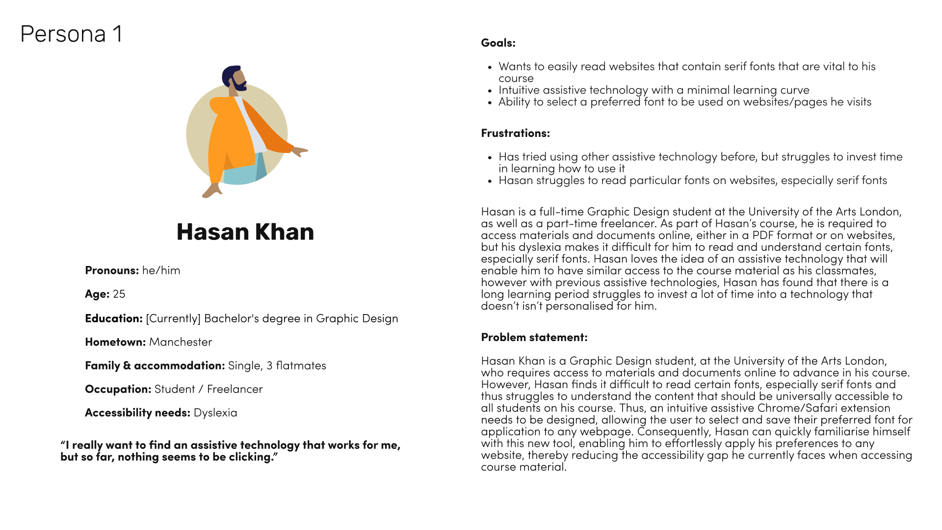
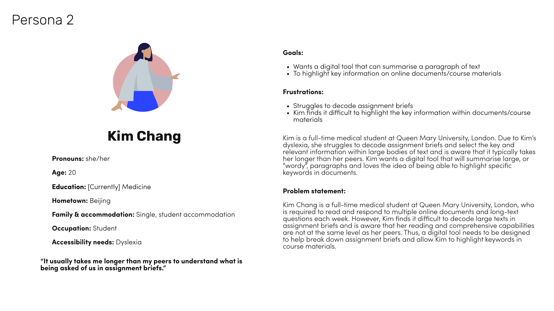
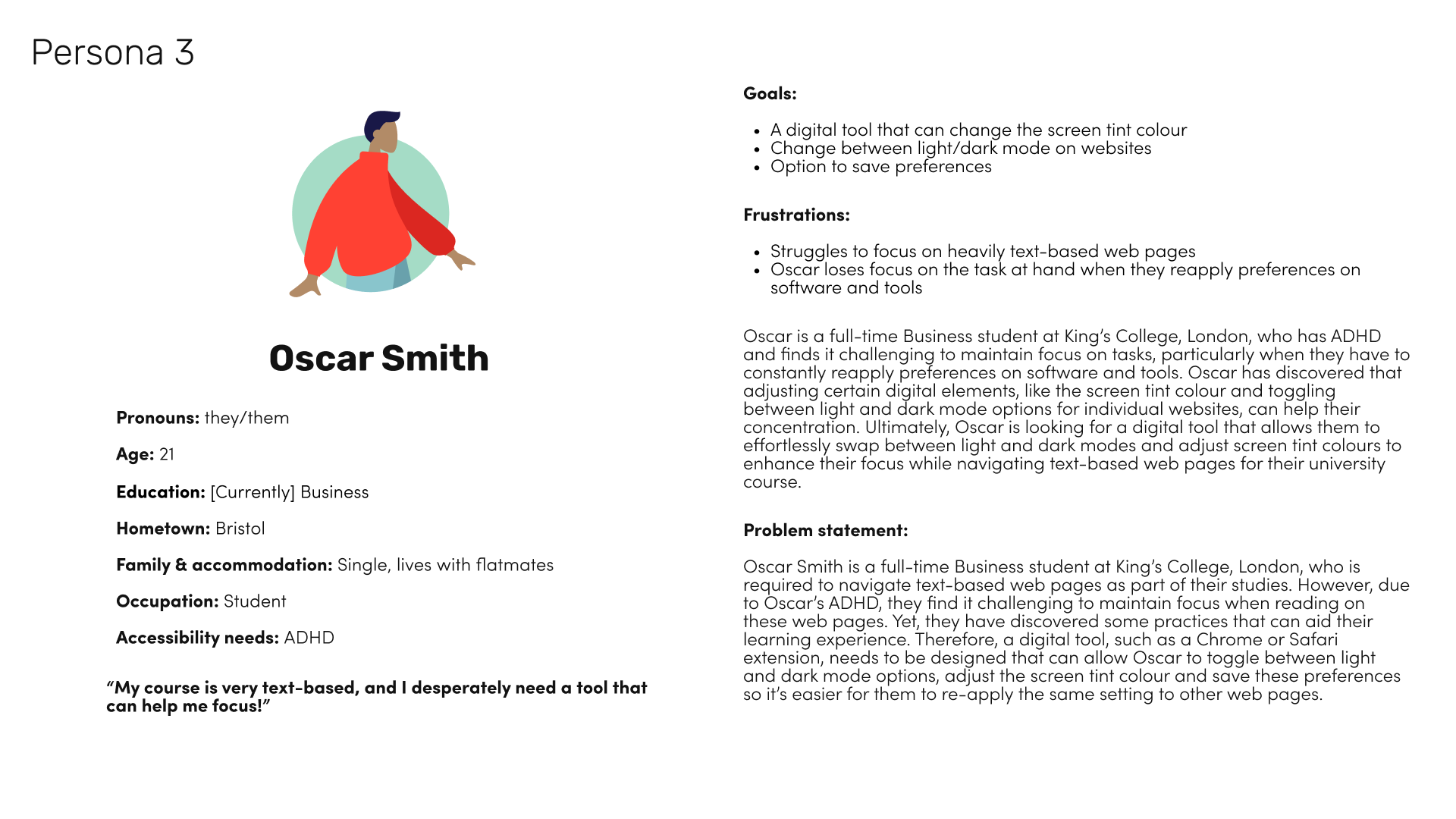
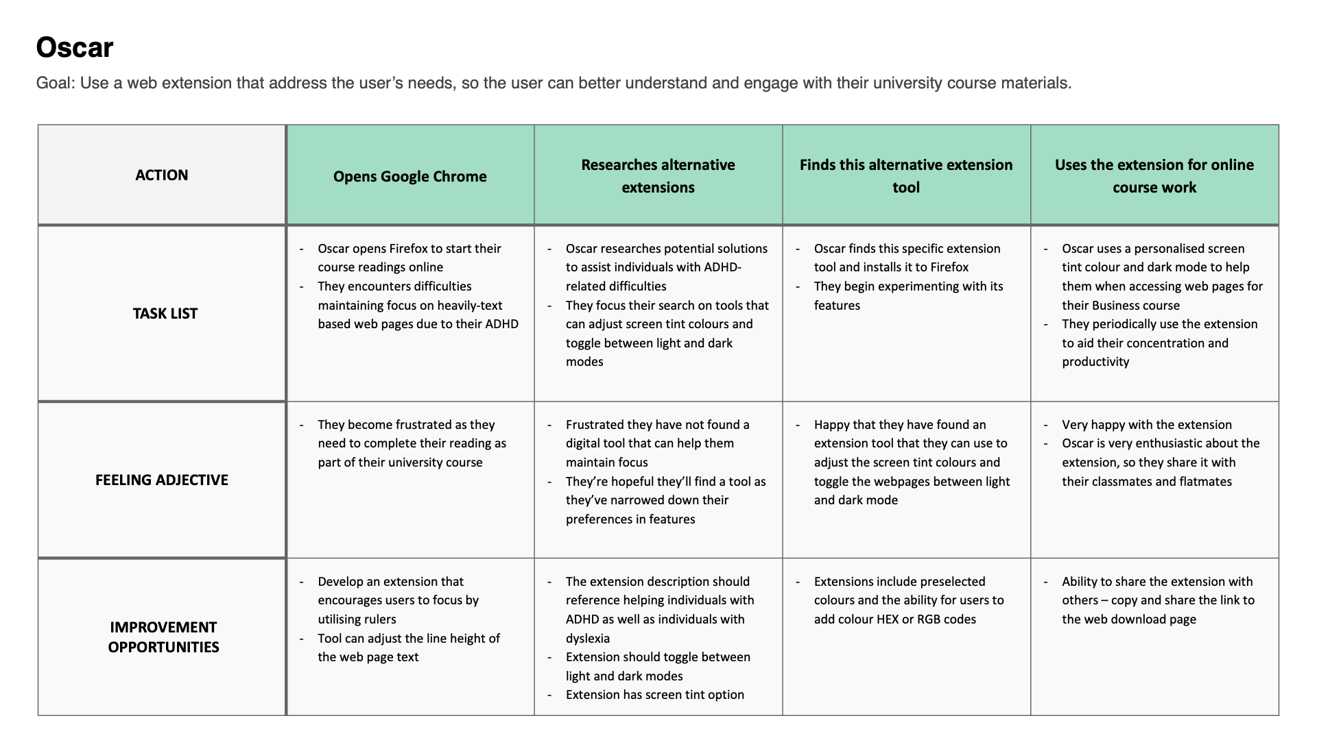
Three user personas were created, each highlighting specific pain points discovered as a result of the survey and interview conducted.
As the survey was a small sample of the larger demographic, the user personas only represent a small fraction of the larger intended audience. Furthermore, each persona studies and/or works in London, United Kingdom, and all have dyslexia or a specific learning difference related to dyslexia.
Despite the limited sample size of the user personas they do offer an insight into existing needs and pain points of university students with dyslexia, and ADHD, who struggle with the online accessibility gap in education.
User Journey maps
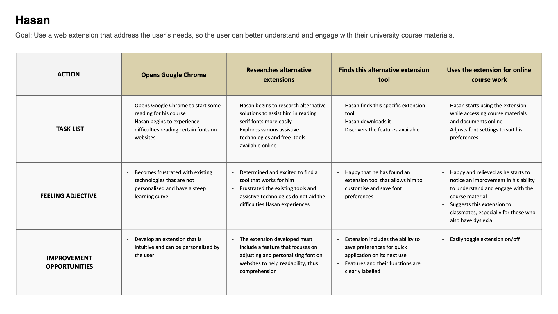
Pain points identified from user journeys include a lack of accessibility options for university students with specific learning differences when accessing online content, such as:
- Difficulty in decoding text
- Summarising large bodies of text
- Navigating through online content efficiently
The user journeys emphasise the need for inclusive design that considers a variety of disabilities, including dyslexia and ADHD, providing features that cater to their specific needs. This can be achieved through icons, pop-ups, and labels for easy navigation as well as customisable features, such as:
- Font settings
- Saving preferences
- Screen tint options
- Reading/decoding text options

Low fidelity sketches
While considering incorporating a ‘quick actions’ section, similar to Helperbird’s design, I ultimately decided it was unnecessary due to the limited number of features that I will include. To ensure I meet the unique selling proposition, where the number of customisable features falls between those of Helperbird’s and Dyslexia Friendly’s, I outlined how a compact extension would function. In this design, only one section can be open at once, ensuring:
- Clarity for users, as they can easily discern which settings are being edited
- Minimal obstruction of the viewed page
Additionally, the ‘Reading’ tab includes toggle switches that determine what popup features are present when the user highlights text.
Digital Wireframes
These digital wireframes aided me in finalising the extension’s layout. During this stage of the design process, I fine-tuned the size of headings and labels, adjusted margins and refined the placement of icons and dropdown features.
High fidelity mockups
The 'typeface' tab displays the current settings used on the web page, including the font, style, weight, colour, and hyperlink colours. However, unlike Fonts Ninja, this tab doesn’t show multiple fonts used on one webpage, as identifying fonts isn't the main aim of this extension. Instead, it’s primary focus is on adjusting interface settings to increase accessibility.
Based on findings from my user research, I opted to replace the darker colours of the initial extension design with lighter, more vibrant, and playful colours. To ensure compliance with web accessibility guidelines, specifically WCAG 2.2 guidelines, I used colorcontrast.cc (Tarpey, no date) to verify that all colours met the triple-A criteria.
The colour selector dropdowns offer a range of bright and bold colours that contrast well against a background or screen tint. Similar to the auto-save function, if users input a colour using the HEX code, it will be added to the list of recently used colours, for easier access in the future.
Prototype
This prototype addresses several pain points identified through the three user personas.
The goals of this use case include:
- Change the font type of a webpage to OpenDyselxic
- Add a blue screen tint colour
- Highlight a selection of text
User testing was conducted with this prototype to assess whether target users feel that their requirements for an accessibility tool have been met.
The goals of this use case include:
- Change the font type of a webpage to OpenDyselxic
- Add a blue screen tint colour
- Highlight a selection of text
User testing was conducted with this prototype to assess whether target users feel that their requirements for an accessibility tool have been met.
View Use case prototype.
User Testing
Feedback from target users and the Special Study Skills and Strategies Tutor was overwhelmingly positive, including comments such as:
- “[I] like the use of off-black and white colours, as people with dyslexia struggle with the harsh contrast”
- “It’s accessible and does the job you want it to do, without the stress of learning how to use it”
- “I don’t know if there’s anything else that’s so simple to click, change features and to understand”
- “Looks nice and playful”
- “Could see myself using it, especially to change the font and screen colour”
- “I wouldn’t want it more complex than that”
I also received some constructive criticism on the design and its application, including:
- “Would it not highlight the text automatically? Why have an extra step to select the highlighter function?”
- “Maybe change the typeface title to font" - it’s easier to understand despite typeface being the correct industry terminology
- “Maybe include a save function, so users can swap between a couple of preferred settings”
- “Could people with visual impairments use the design?”
All comments I received during user testing were valid, and appropriate changes were made to the extension including adjustments to the highlighter function, language and saved preferences.
Design System
Takeaways & Next Steps
Some takeaways I’ve learnt through accessible.’s design process include:
- Understanding accessibility needs of university students with dyslexia and other specific learning differences
- Recognising the social impact of design by promoting online accessibility to help bridge gaps in online learning and education
- Emphasising human-centric design by prioritising the user’s needs and experiences
- Acknowledging the necessity of continuous improvement; recognising that there is no one-size-fits-all solution, thus products should evolve alongside the needs of their users and communities
Next steps for accessible. include:
- fully realise the extension
- conduct further user testing with a wider testing group, involving users with dyslexia, other learning differences (such as ADHD) and other accessibility needs such as those who are colourblind
Once completed, I plan to make this extension free for anyone to use. I then plan to promote accessible. through word of mouth and by contacting universities, schools, and study support tutors who can recommend this extension to students who might benefit from it the most.
End of case study.
Ask to see the process in more depth.
Ask to see the process in more depth.