Client: Aimsun
Role: UX Designer
Responsibilities: Developing iterative mockups, conducting usability studies, and accounting for accessibility.
Brief: myAimsun is a user portal, introduced to support Aimsun’s transition to subscription-based licensing. The design emphasises simplicity, efficiency, and flexibility, making everything — from licences to projects to team management — accessible from one platform.
Tool: Figma
Overview
Developed the user portal based on technical requirements from the Product, Development, and Customer Operations teams. The initial design was produced over four months, with an additional month dedicated to iterating on the design based on user feedback.
Research Summary
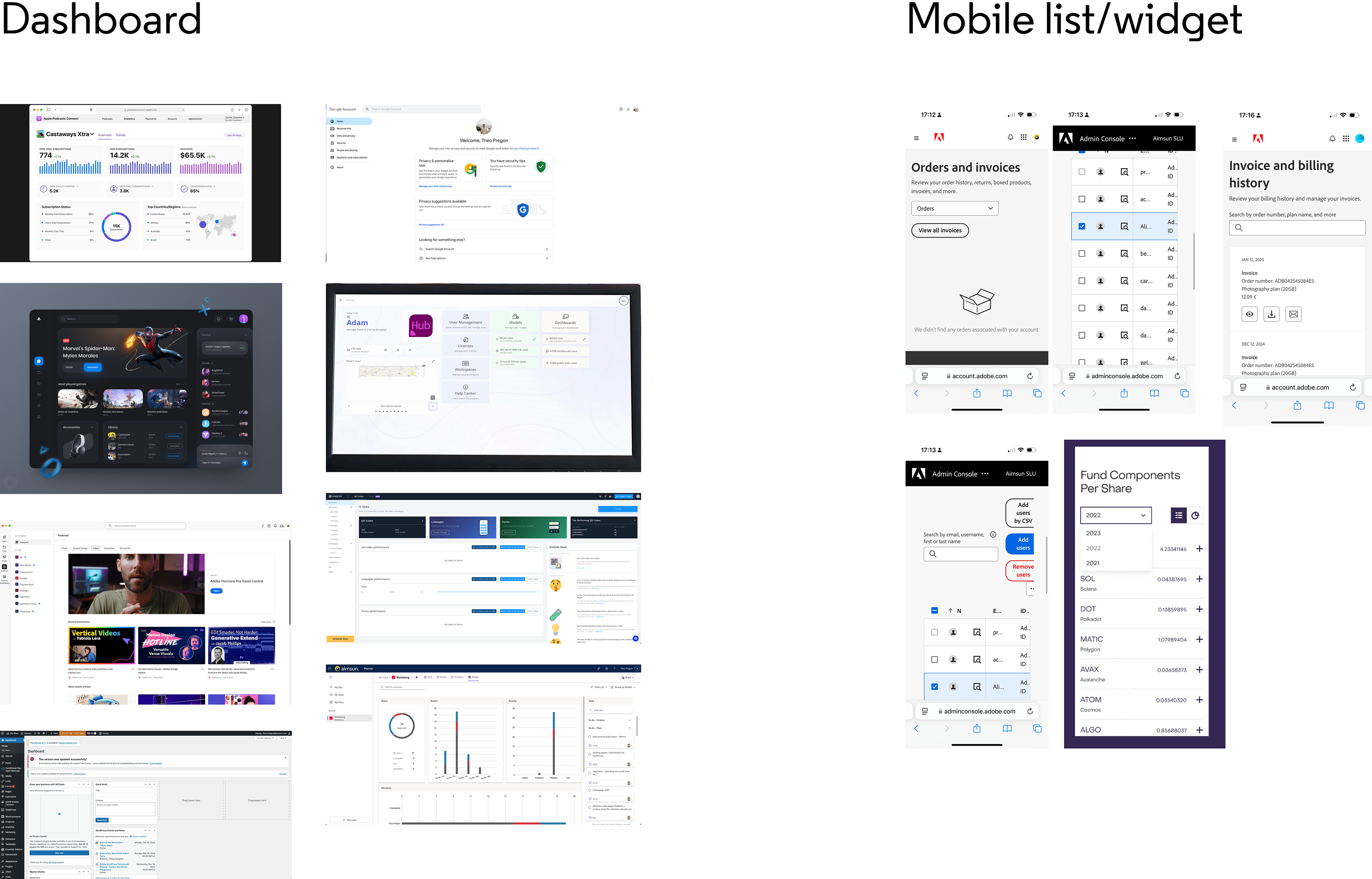
Primary research was conducted to examine existing and successful user portals and admin pages, including those by Google, Microsoft, and Adobe. It was vital to investigate responsive design, as internal user research indicated that a high volume of Aimsun customers use their mobile phones to access products.
To accommodate both desktop and mobile use, and to build upon existing user knowledge of navigating an admin portal, this portal needs to be versatile and intuitive. Additionally, the user portal will be consistent with current Aimsun branding, focusing on the yellow and navy colour palette to distinguish this product from other existing Aimsun products.
User Flow
Due to the tight timeline for delivering the first iteration of the user portal, I used initial sketches and bullet points outlining the sequence of user journeys to shape the first low-fidelity mock-ups. These were then quickly refined and tested with the development teams to clarify key user journey flows – including accessing and managing products, licences, and team administration.
Design System
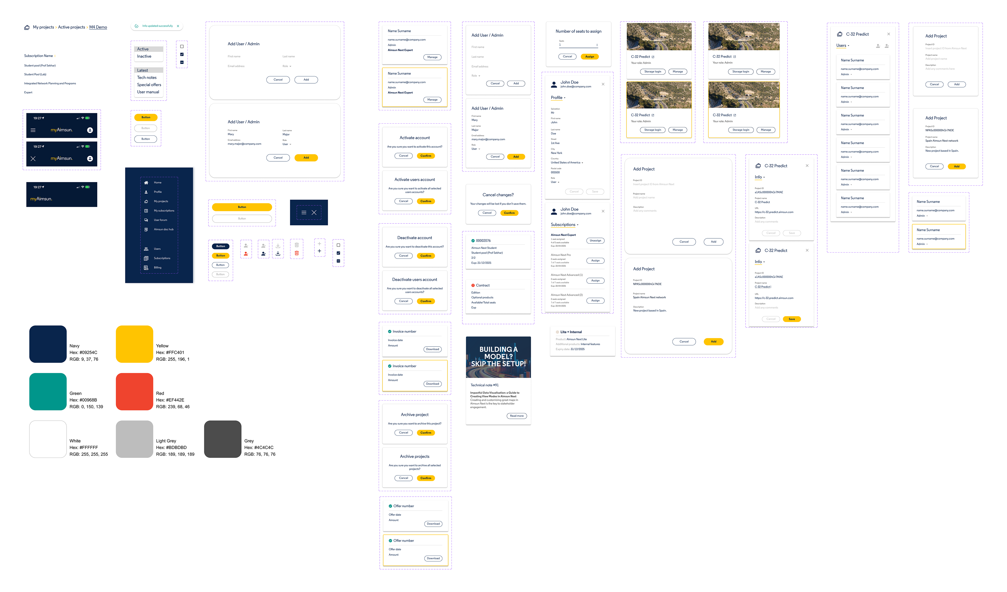
mockups and Prototype
After several mock-ups, internal user tests, and updates, Mock-up V5 was produced. Using a design system, each screen was systematically updated to ensure the development of a concise, practical, and accessible user portal.
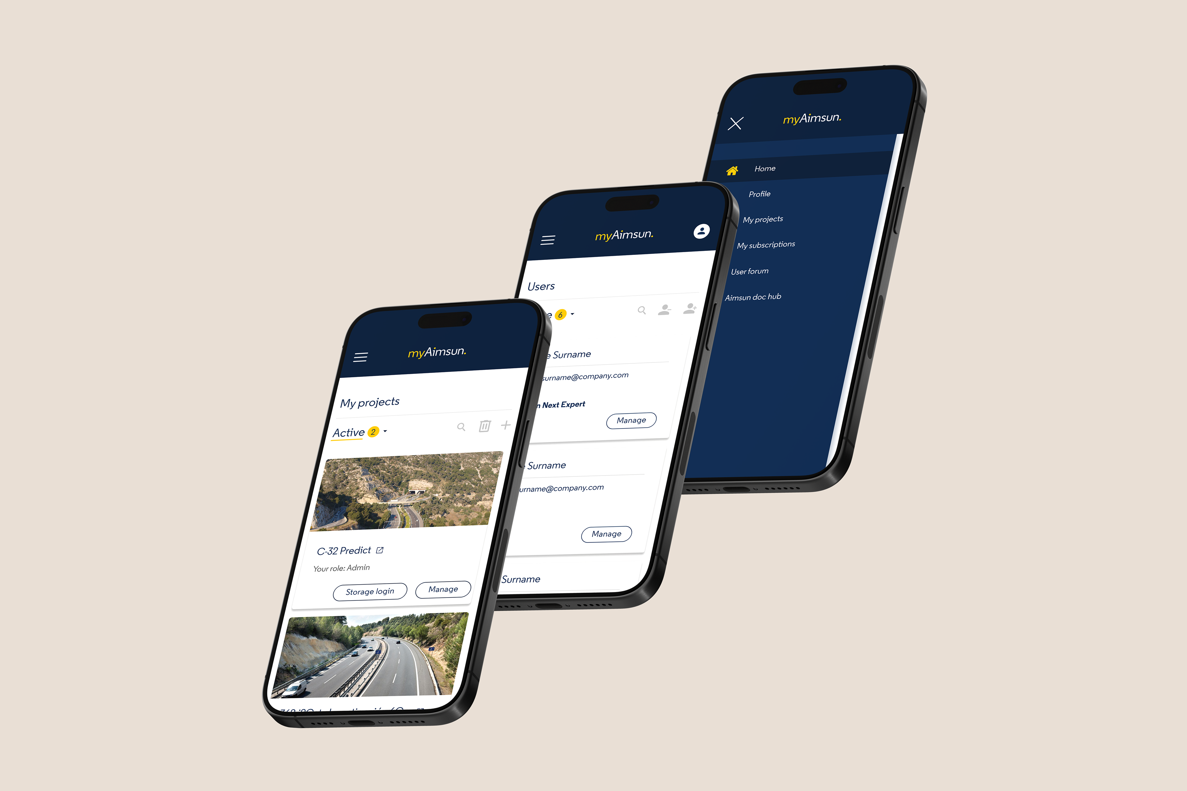
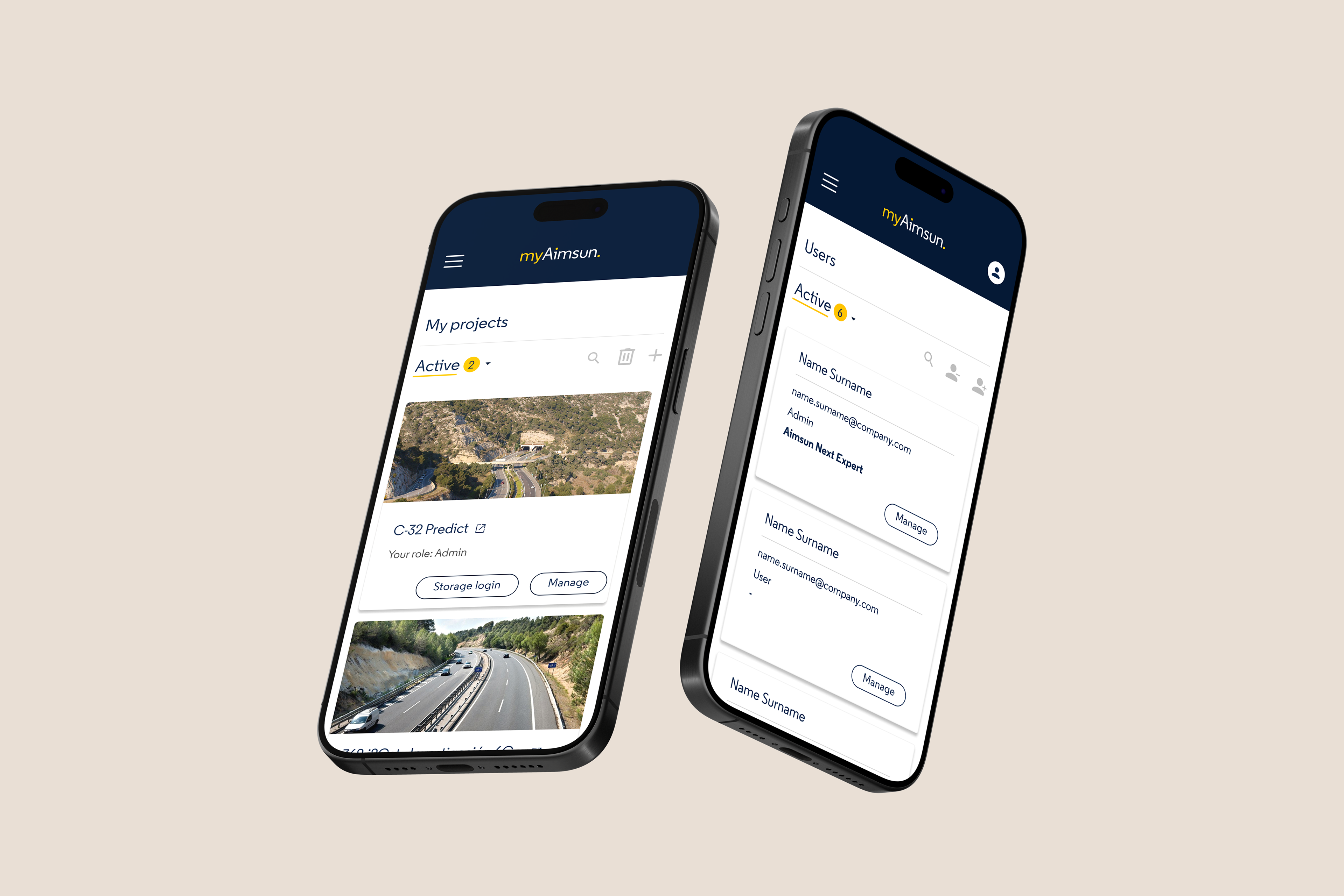
One key aspect of the design is the mobile widgets. After several iterations of the desktop version, I found that a single tile or list view was neither accessible nor usable on mobile screens. To address this, I designed a widget specifically for mobile, combining elements from both the tile and list layouts. This widget design significantly improved usability and accessibility – particularly for users who primarily access the platform via their mobile devices.
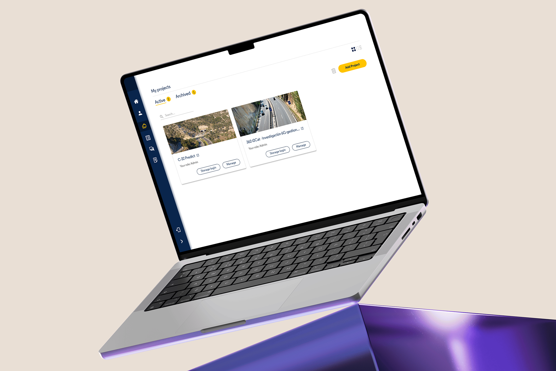
After a year of the user portal being live, the Customer Operations team collected user feedback, and together we refined the UI. Some of the updates included clearer button states, the removal of side panels in favour of a full-screen interface, and a redesigned homepage featuring the latest news. These iterative changes ensure that user needs continue to be met, while Mock-up V5 establishes a solid foundation for future additions to the user portal.
End of case study.
Ask to see the process in more depth.
Ask to see the process in more depth.